Friday, October 17, 2008
Tuesday, September 23, 2008
CS3343 assignment 1 & 2
Latest creations in school.
Solo project. Just some static images flashing by and a narration. Nothing fancy.
Director for this one.
Solo project. Just some static images flashing by and a narration. Nothing fancy.
Director for this one.
Tuesday, April 8, 2008
StoryBook Assignment: Character concept
Yeah the grand finale. This is the character concept i designed for the finale:

The storyboard involved:
And here are some pages that are done:


The storyboard involved:

And here are some pages that are done:

Wednesday, April 2, 2008
Assignment 6: Like or dislike?
This assignment, what I have to do is to pick a poster (or something similar, whatever I please) I like, and dislike, and point out why.
Problem is, ugly posters are hard to find, and I don't think people will be pleased if I were to use posters hanging around in school. So I finally picked the following two:
This is the like,

Reasons for like:
+Continuity gives the poster the flow
+Figure and ground is clear-cut
+Colour contrast gives a grandeur feeling
+Centered skeleton grabs attention
And this is the dislike.

Reason for dislike:
-Choice of colours makes foreground blend into the background.
-Light rays and the wordings are not flowing in the same direction.
-Figure and ground is not clear. Colours blend together
-No clear focus, viewers will easily wander off the poster.
-Positioning of the elements have no similarity nor proximity.
Wednesday, March 26, 2008
Assignment 5 Second Strike
Right. There weren't much changes needed so it was a quick job.

comments and eggs please.

comments and eggs please.
Wednesday, March 19, 2008
Assignment 5: LOVE
It's done! I realised my sketch and the final are two worlds apart.

Explaination: A grey background with silhouettes to show the masses and monotonicity of the world, and a pink lady tied to a blue dude by a thread turns. There's a cultural reference here for the red string, as it's referring to Yue Lao, the matchmaker in Chinese folklore. So the jerk from the string halts the couple and their things fall off from their hands to show the shock and impact of the moment.
And as for the logo, well, no love is complete without some humour, no? Comments please!
Some I got was:
- The. Words. Are. Bad. i.e. the font needs to be a little more classy, and the colour is not complementary with the existing powder pair (pink and blue). The positioning of the words are not appropriate as well, but there's barely space for the words too, so I have no choice but to place the words where they are.
- The background is too dark, but its a necessity. The foreground elements are of a powder pink and powder blue. These colours are light and pale in nature. Should the background be any lighter, they will blend into the background, and the meaning in the card will be lost.
- The matchmaker's string needs to be more prominent. Possibly a brighter red or a little glow on it.
Tuesday, March 18, 2008
Assignment 5: LOVE - sketches
Finally I jumped onto a scanner, so i scanned in the sketches just to show people what went through my mind. =/ The assignment this time round is to make a card. A greeting card based off a theme of love (No killing this time round. Damn.) and so my mind churned out these two ideas:


So yeah. It's hard to see what ideas they are conveying so I'll probably stick to the top one, and see how it goes.


So yeah. It's hard to see what ideas they are conveying so I'll probably stick to the top one, and see how it goes.
Wednesday, March 12, 2008
Assignment 4: Save/Kill/Prevent something.
Assignment 4 is about doing a poster to help or destroy something. So I wondered what idea to use when my girlfriend suggested rabbits. Turns out that her boss is born in the year of the Rabbit, so in exchange for taking up her challenge, she will be pinning a printout of this poster in her office, and preferably, take photos of her shocked boss staring at the poster.

The design layout was intended to draw attention to first "Kill the Rabbit!!", then subsequently, the rabbit in the crimson moon (I had no idea how to draw an illuminated moon though =/), then to the mountain of carrots, then the minions, then finally the small print, since the majority of the message would have been brought forward by the more prominent details. What are your views?
Some I received was:
1. The night sky can be crimson with a white moon, rather than a red moon with a deep blue night sky.
2. "Kill the Rabbit!" needs one exclaimation mark less and be of a bolder font, to be more prominent.
Overall this assignment is quite welcomed because its against the norm, which is relieving for me. =D
Wednesday, March 5, 2008
Assignment 3: You see what I see

After finishing this one, I got kinda worried because everyone who saw it couldn't understand the story. It might be because I used a story that requires a little of a twisted mind to comprehend. We'll have to see.
post war: Comments I received was -
- The final frame was nigh understandable. It was only when I pointed out that it was scythes on the floor did people go "Ohh..." That one needs editting.
- The twist is too shady, and more than one twist makes the story harder to comprehend. The original intention for the twist is that I beat the Reaper, and that more than one has tried to collect my soul, but I figured that this is not good: People cannot get the twist easily. The climax was also not very prominent as well. Might be changing the last few scenes totally.
Monday, March 3, 2008
Sigh...
The lack of a scanner is making my blog updating hard. The storyboard goes here once I get my hands on a scanner.
Monday, February 25, 2008
Assignment 2: The aftermath
Okay, everyone gave a lot of valuable feedback which opened up my eyes to some of the things i missed out. Some of the comments include:
- Start and Select buttons of the GBA can be removed, since they aren't that important
- the screen on the last level of abstraction should stay, but with only one square
- The "joint" in the middle of the GBA needs to go. (I disagree on this part though: The speciality of the GBA SP is the flipping joint)
So after caring about those comments, i did a revision:

As for the final choice for symbolizing, it would be the 5th image, but others may differ on this point.

Assignment 2: Abstraction
Right. This assignment now is to take an existing object, abstract it, and then further simplify it into a symbol of the original. The original can be iconistic or indexic. So, this is what i managed, using a GBA SP as my choice:

This image was uploaded to a forum, where we had a pointer exchange. Next post will be on the comments made.

This image was uploaded to a forum, where we had a pointer exchange. Next post will be on the comments made.
Wednesday, February 20, 2008
Wednesday, February 13, 2008
Assignment 1: Prototypes
At last they're done!

Comments: The pisa tower draws too much attention. =/

Comment: The cockroaches draw too much attention away. The Spray misleads the letter V to become N. Too much detail, gotta water that down.

Comments: The pisa tower draws too much attention. =/

Comment: The cockroaches draw too much attention away. The Spray misleads the letter V to become N. Too much detail, gotta water that down.
Tuesday, February 12, 2008
Assignment 1- Me Myself and I : Tutorial draft
After a few revisions and reflections, I drew up the following for tutorial:
This is the "Love to draw" theme. The feedback I got:
First one: The drawing mediums were not enough. That I agree, but if I were to add more, it might cause confusion and make the piece seem like I like Art, more than I like drawing. Second is the straight strokes. It's better that they are one continuous stroke. Easier done on Photoshop than paper, though.
Second one: The stickmen need to be more expressive, and need to have some varying factor. Well, though they have no face, they still can dance more, so I'm improving on it. Most likely this will be the final one too. Gotta love stickmen.
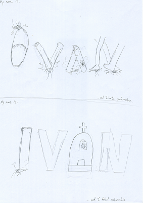
This is the hate part. I figured that I hate cockroaches much more than the game controller so I switched to this theme instead. The comments:
First: Slipper is too ambiguous. The insecticide isn't obvious enough at first glance. Cockroaches aren't obvious enough. The newspaper needs to have more details on them to make it look more obvious. All point taken. This will definitely be my choice for the final.
Second: Too plain. The tombstone needs more texture. The letters V and N needs more expression. I made the mistake of showing the first drawing before the second, so it was a "nice and not so nice" instead of a "nice and nicer" =/
Nevertheless, it definitely needs alterations.
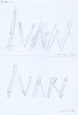
Assignment 1 draft
Right. We were given an assignment on NM2208 to draw my name using a theme based on something that I like, and then revert it to hate, which kind of boggles me since it is hard to find a reason to hate something you like. Anyhow, I drew up this:

The second one on the left was a no pass: It totally didn't meet the requirements of the assignment. The first one was, well, kind of plain. It didn't bring forth a lot of like. =/
And then was the hate part on the right. It was hard to imitate machine fonts, but I gave it a shot anyway. Both weren't obvious enough, as the second one was supposed to be cutouts from newspapers and then stuck there, but the rough sketch didn't make it obvious enough.
Subscribe to:
Posts (Atom)