Monday, February 25, 2008

Assignment 2: The aftermath

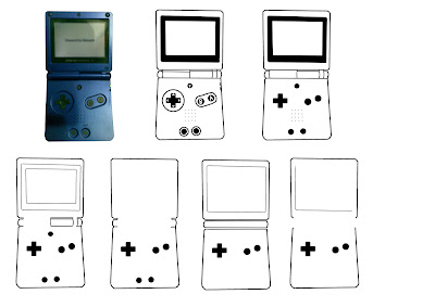
Okay, everyone gave a lot of valuable feedback which opened up my eyes to some of the things i missed out. Some of the comments include:

- Start and Select buttons of the GBA can be removed, since they aren't that important
- the screen on the last level of abstraction should stay, but with only one square
- The "joint" in the middle of the GBA needs to go. (I disagree on this part though: The speciality of the GBA SP is the flipping joint)

So after caring about those comments, i did a revision:


As for the final choice for symbolizing, it would be the 5th image, but others may differ on this point.

Assignment 2: Abstraction

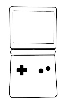
Right. This assignment now is to take an existing object, abstract it, and then further simplify it into a symbol of the original. The original can be iconistic or indexic. So, this is what i managed, using a GBA SP as my choice:


This image was uploaded to a forum, where we had a pointer exchange. Next post will be on the comments made.

Wednesday, February 20, 2008

reserved!

Till i scan in the class activity drawings.

Wednesday, February 13, 2008

Assignment 1: Prototypes

At last they're done!


Comments: The pisa tower draws too much attention. =/


Comment: The cockroaches draw too much attention away. The Spray misleads the letter V to become N. Too much detail, gotta water that down.

Tuesday, February 12, 2008

Assignment 1- Me Myself and I : Tutorial draft

After a few revisions and reflections, I drew up the following for tutorial:


This is the "Love to draw" theme. The feedback I got:
First one: The drawing mediums were not enough. That I agree, but if I were to add more, it might cause confusion and make the piece seem like I like Art, more than I like drawing. Second is the straight strokes. It's better that they are one continuous stroke. Easier done on Photoshop than paper, though.
Second one: The stickmen need to be more expressive, and need to have some varying factor. Well, though they have no face, they still can dance more, so I'm improving on it. Most likely this will be the final one too. Gotta love stickmen.


This is the hate part. I figured that I hate cockroaches much more than the game controller so I switched to this theme instead. The comments:

First: Slipper is too ambiguous. The insecticide isn't obvious enough at first glance. Cockroaches aren't obvious enough. The newspaper needs to have more details on them to make it look more obvious. All point taken. This will definitely be my choice for the final.

Second: Too plain. The tombstone needs more texture. The letters V and N needs more expression. I made the mistake of showing the first drawing before the second, so it was a "nice and not so nice" instead of a "nice and nicer" =/
Nevertheless, it definitely needs alterations.
Assignment 1 draft

Right. We were given an assignment on NM2208 to draw my name using a theme based on something that I like, and then revert it to hate, which kind of boggles me since it is hard to find a reason to hate something you like. Anyhow, I drew up this:


The second one on the left was a no pass: It totally didn't meet the requirements of the assignment. The first one was, well, kind of plain. It didn't bring forth a lot of like. =/
And then was the hate part on the right. It was hard to imitate machine fonts, but I gave it a shot anyway. Both weren't obvious enough, as the second one was supposed to be cutouts from newspapers and then stuck there, but the rough sketch didn't make it obvious enough.